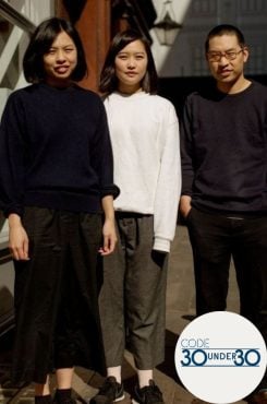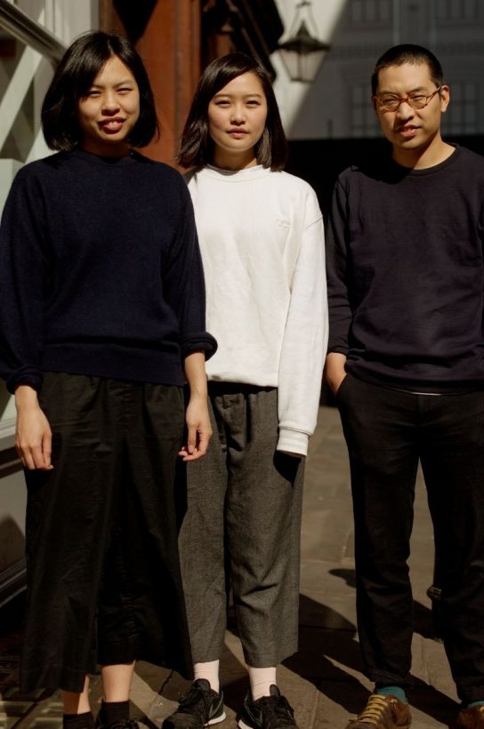
In this regular feature, we take a look at the workspace of people who inspire us. Here co-founders and husband and wife Shing Tat Chung and Erchen Chang talk us through the process of BAO’s brilliant design and imagery, including the clever packaging and products they created during lockdown
The BAO character – a man eating a bao bun – has become a beloved part of London’s restaurant scene. What was the inspiration for him and how was he created?
The BAO character originated from one of Erchen’s artworks that was also exhibited in her degree show, as well as New York. It was a performance titled ‘How to be a lonely man’ – and the drawing was part of the installation – it depicted the perfect lonely man pose. Soon after her graduation, BAO was formed. Our BAO character is an evolution of this character. Erchen was always inspired by Japanese B movies – particularly the classic salary man character – a stereotypical man who wore oversize suits, dined alone and had very particular emotions.
Did you both study art?
Yes, Erchen and I met at the Slade School of Fine Art – just around the corner from BAO Fitz. I went on to study Design Interactions at Royal College of Art before we started BAO. Whilst we started studying in more traditional art applications, we both ended up towards more the conceptual side of art. But really, that quick turnaround of work, from idea to materialisation (and especially in the Royal College where it was three weeks of Brief – Create – Make – Present, on repeat) was how we flowed into creating BAO, which was very much the same creative work ethic but in this case with our other passion – which is food.
What technique do you use for drawing?
We do various types of drawing and illustration. In terms of the BAO illustrations you see more commonly, it’s all about sketching and re-sketching, and tracing until it gets to the closest form. I then take it into an Illustrator on the computer to then turn it into a graphic. We have all the original drawings and lots that never make it – we should do an exhibition one time.
Some of the other BAO imagery is more graphic and looks computer generated (I’m thinking of the buildings and the BAO Borough menu pictures). Do you commission other artists to do those?
Yes, definitely. We love working with friends and also artists and illustrators that we come by. One of the rewarding aspects is giving a platform for emerging illustrators. We enjoy using different artists in BAO because it illustrates and gives another type of interpretation of the world we want to depict. It’s not just 2D drawings and illustrations. It also expands into other forms and those crafts deserve the same attention as you would to commissioning an illustration. For example, we work with our friend Anna who does hand thrown pottery for our restaurants and each restaurant adapts a different style.
The artist you’re referencing for the computer-generated graphics is @isometricpixelartist – his style is so unique and it really helped give Rice Error the retro gaming style we were after.
The BAO t-shirts have a cult following. How and when did you decide to create merchandising for the brand?
We first had the BAO tote. And it was an arbitrary decision – most restaurants and cafes had one. But what followed was quite interesting. We noticed that a lot of people were taking the tote abroad and representing BAO, tagging us on Instagram etc. It also got to a point where other people spotted the BAO bag in different countries and sent it to us.
Having merchandise was also another platform to be creative with and also to reconnect to our pasts of fashion, design and art but it’s really only now, thanks to lockdown, that we began to think more about how we could expand our online retail offering. It’s something that made a lot of sense from a business perspective, and was a lot of fun too. Some of Erchen’s new pieces include limited edition riso prints, as well as teapots. This is something we’re building every day.
All the new t-shirts are limited edition, so once they sell out they’re gone. The Weeping Sake is quite a fun one – we’ve released two so far: the 15% and the 20% Tears. As the tears increase, the guy gets older and older and sadder. We have also given a handful of personalised t-shirts to the staff that have stayed with us for a very long time (what we call BAO Originals). Erchen draws the member of staff with a very old BAO Man holding each other. It’s great.
The BAO website has travel guides – do you see yourselves as vanguards of the Taiwanese experience and how often do you go there to research and immerse in the food scene?
We try go back once a year. Sometimes even twice if we have a specific research item. Erchen is from Taipei – so it makes sense to try and go back as much as possible but also important in terms of food and re-immersing in Taiwanese culture. Taiwan is well known as a food destination in Asia – however when we started there wasn’t much education around Taiwanese cuisine – so we felt it was important to educate Taiwanese culture not only through the restaurants, but with guides. Whilst Taipei is more explored – it can be hard to find guides for the other cities in Taiwan – which is something we are working on. However, although the focus is very much Taiwan, we don’t restrict our inspirations to just here. Café BAO (which was due to open this year in King’s Cross) is heavily inspired by Western style cafes in Asia – especially Kissatens. So we have an Osaka guide lined up that showcases some of those older style eateries. Moving forward, we not only want to have guides, but restaurants acting as a representation of an area. We try to create restaurants as our interpretations of types of eating culture (Grill culture, Western style dining, Streetfood etc). And that is represented by our travels and thus guides.
Lockdown has created both difficulties and opportunities. Your Rice Error brand was an immediate hit – how did you decide what it should be?
As soon as we started to see sales dip near Chinatown, we knew we needed to think seriously about creating a delivery offering. Delivery was always something we had considered, but we’d never really settled on the details. As things started to escalate with COVID-19, we knew we needed to sit down and be creative.
The main concern with delivery was that we didn’t feel BAO was suited for travel. If you’ve ever eaten a Classic BAO in one of our restaurants, you’ll understand how the idea of sending one off on the back of a bike could be stressful. We hated the idea of things turning up in a way we wouldn’t be happy to serve them in a restaurant.
Then we started thinking beyond BAO. We’d always had this idea about creating a restaurant with rice as the core product. There’s an award-winning grain of rice we use in all our restaurants that comes from a place called Chi Shang in Taiwan. We’d often talked about doing something with it on a bigger scale – whether that was a restaurant concept or a pop-up, we weren’t sure. We took that little seed and grew it into Rice Error.
And how did you decide the name and design – and create it? Even the instructions have a very individual look and way of explaining.
The name was surprisingly easy – Rice, because rice was the core product, and Error because the whole situation felt like an error. It felt quite a fitting name for a brand born out of a disaster. One of our ethos at BAO is to also be unconventional – so Error felt right.
The next step was to create the logo and a bit of a brand essence. I always think it’s best to start from here, as if it’s done right it can really motivate the rest of the journey and get people behind the idea. We wanted something bold and sharp and it really complimented the bamboo boxes that we sourced. All the packaging in Rice Error is biodegradable.
I then got started designing the website and passed it over to our friends at Twelve Studio who transformed it into a fully functional site, ready for orders. We were blown away with the reception Rice Error got in its first few weeks and are looking forward to seeing which direction it will take post-lockdown. We’ve had an international guest chef series too, which has been great – and parts of the proceedings go to St Mungos.
More recently there is Call Suzy, which again had a central character fully formed. Is she based on anyone in reality?
Yes and no, but Erchen did joke that it looked like my mother when she was younger… so maybe it was subconscious. My parents did own takeaways so it does make sense. The starting point, however, was more the name Suzy which was taken from lazy susans – something that is associated with the old Chinese restaurants we feel nostalgic about. From Suzy we wanted to form a character that would become the logo.
And that image of someone on at a counter answering phonecalls is synonymous to the Chinese takeout. Call Suzy also has that ring to it – I guess similar to ‘Call Saul’. So Call Suzy – for your Chinese takeout needs.
With the theme of the Chinese takeout we wanted to use the American style takeout boxes – they’re kind of a cliché – but we love that. And we wanted the design to be a bit more colourful and closer to the bright colours of Taiwan. For Call Suzy we didn’t work with anyone else. So the illustrations were drawn by Erchen. And the graphics and packaging were done on the computer by me. Photography that was used in the packaging was also done by us. We don’t normally do that sort of thing ourselves due to a heavy workload, but at times like this its makes sense to do these things ourselves. It’s lucky in a way – because it enabled us to launch Rice Error and Call Suzy quickly. In a normal situation (if we had to pay a designer etc) it probably wouldn’t have come to fruition – or at least not as quickly.
Please answer a debate I have with my husband about the Bakery Goods box in the BAO kit – is he holding a bao bun or is he looking sad?!
Both – he’s holding a BAO bun and he’s sad, but he is proud that he has made that BAO.
To read more articles from the latest edition of the CODE Quarterly, click here
Search results